Category Archives: How-to

Logos for a small business – what to consider

Kaleidoscope Cropped


I’ve been experimenting with logos for my new business.  Same old company, just re-branding in a modest sort of way.

What are the important considerations?  Here’s what I wanted:

1.  Eye-catching, engaging in all media – online, business cards, letterhead (does anybody print that anymore?), newsletters, ads

2.  Consistent with mission of the company – Represents the different business lines without being confusing

3.  Owned by the company.  Believe it or not, ad agencies try to own your logo if they create it for you.

4.  The jpg is easy to work with and can be easily dropped into any new communications.

Most of you know that I’m an independent distributor for LifeVantage products – all two of them:  Protandim and True Science.  Because these products represent breakthroughs in free-radical science and treatment for oxidative stress, I wanted to choose something for my company that looked “healthy” or “scientific” without being ho-hum.

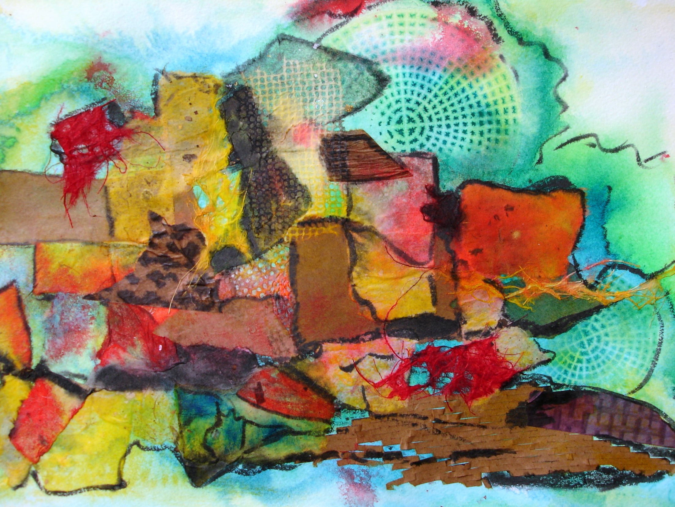
You might ask why I’m not using their biz cards, or logo.  It’s because The Stockholm Companies needs its own identity as a portal to get to LifeVantage or my art or technology consulting work.  I wanted to use my own creation in an interesting way and then use technology to morph it.  It had to have flow, look appropriate and be fun and colorful.

The Runner - Acrylic on Canvas

At first I tried The Runner, but the colors didn’t pop when I put them up on Facebook.  And I couldn’t get the Runner looking right on the website blog because the banner was long and narrow, and the Runner was tall and skinny.

Kaleidoscope

So I found an old blue and white print, where I’d used a kaleidoscope function to morph it on a red background.  I’m trying it out on the website and have made some business cards, too.  Facebook has it as a fan page called “Protandim for Baby Boomers” – I need 25 visitors to like it in order to have my own link, which should happen soon. So if you want to see more details and how the logo looks on FB, just do a search for it.

If you want to know more about Protandim and True Science and see the beginnings of my company blog, please visit: www.stockholmcompanies.com/blog – let me know what impresses you about the products and what you think of the logo.

Have a great week!

Susie

Curiosita

Sedona Sunset - Experimental Painting, Acrylic Ink, Collage, Papers, Gauze

As a business woman, I have lived by my wits, using creativity and invention to fulfill on client requests.   As an experimental artist, I live in this same place of Curiosita.  Currently, I am re-reading How to Think like Leonardo da Vinci by Michael J. Gelb. He describes Curiosita, this first of seven Da Vincian Principles, as “an insatiably curious approach to life and an unrelenting quest for continuous learning.”  How fun is that?

The experimental artist starts by asking a question: “What would happen if…..if I let these two inks merge….if I added washi paper here….if I collaged on some interesting shapes…if I scrunched up plastic wrap and left it there until the painting dried?”  The entire piece is created through inquiry.  And it’s one that doesn’t stop after the painting is complete.  You will see something different each time you look at it, if you’re curious.

Many times I’ve tried to think in advance of what I want to paint.  It really never comes to me until I start.  It’s a lot like writing.  If you just start writing, the ideas and characters show up.  There is something to be said for doing sketches if you’re trying to create something recognizable.  Value studies are good to see if your piece is balanced.  My value studies come from photos of the painting as I’m working on it.  I will switch the photo output to black and white to see if I have a preponderance of one value in an awkward place or whatever else might need tweaking.

Soulmate - Experimental Art, collage, acrylic ink, weaving

Usually I will choose three colors of acrylic ink that will be interesting alone and in combination.  For example, the colors of purple and yellow when run together, make a luscious brown that you can’t get any other way.  One of my favorite pieces “Sedona Sunset” (shown at the top of this post) was an experiment to discover what would happen if I mixed turquoise blue ink with orangey red.

“Soulmate” was also an experiment in color with blues and reds, so it comes off as purple.  This one I sketched out and carefully designed.  When it was finished, I thought it was too structured, so I cut it into strips and wove it back together, collaging on some of the leftover pieces.  Then I wove gold wire through it for a final touch. It’s one of my favorites.

When you look carefully at “Disk Derby”, you’ll see that I used a variety of textures, but all the shapes are circles.  This adds consistency to the piece.  For more interest, I ran threads of dyed gauze throughout.

Disk Derby - experimental painting, collage, acrylic ink, papers, gauze

The joy that erupts when I’m creating is equaled only by singing in a choir that is so good you can feel the overtones.  It’s an energetic experience and one that I hope for you when you purchase and enjoy my paintings.

Inventing with the Mundane

Something else you can play with that’s really fun, is to take photos of household items and then spiff them up to make great photo gifts.  Here’s one I took of the inside of my washer.

Photo or the inside of my washer, digitally enhanced

Originally I took the photo because this new washer had a rust spot, and I wanted to document it before I emailed the store manager for a replacement.  A couple of months ago I was looking through my photos and thought this one was intriguing.  So I did some color enhancement and added a texture called “ink” and now it looks like waterdrops.  The piece is appropriately named Whirlpool.

Morphing a Collage

Morph a Collage Digitally and Literally

Great color and texture but poor design

Today I “finished” a very colorful collage. You can see that the design is not good, but there are some nice areas of color and contrast. So I photographed the entire piece, and also some areas that I liked. I also digitally clipped a few spots out of the collage. These I will use for prints and notecards or for a digital collage. I also tear strips of prints and even use pieces of old collages in new ones. Nothing gets wasted over here!

Here are three clippings:

This clip captures the diversity of textures in the original

Photo Clip
This photo clip could make a fun greeting card with a little tweaking – texture or paint
This clip is pretty dramatic and could be a framed print for the right person!

There are a lot more places to clip out of here. One collage can make a lot of digital designs. And if you’re good with Photo Shop, you can enhance these and have a wonderful time!

Next I painted diluted gesso over the entire thing, adding a few more collage pieces. It’s a lot more interesting now, don’t you think? I’m certainly more excited about it.

Here it is ready for the next adventure!

Tomorrow when it dries and flattens, I will lightly add some watercolor using a dry brush. This is just to bring out the texture and see who or what wants to come out and play. Isn’t this fun?

I hope you are able to follow-along and enjoy collaging. The real trick to having fun is to realize that everything you create can be turned into something else if you don’t like it. But, don’t be too hasty to destroy a piece. Sit with it for awhile. Sometimes I look at my paintings and collages for months before I decide which way is up; or if it has any meaning besides a colorful and interesting design.

Stay tuned!

Love,

Susie