Monthly Archives: April 2011

Logos for a small business – what to consider

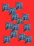
Kaleidoscope Cropped


I’ve been experimenting with logos for my new business.  Same old company, just re-branding in a modest sort of way.

What are the important considerations?  Here’s what I wanted:

1.  Eye-catching, engaging in all media – online, business cards, letterhead (does anybody print that anymore?), newsletters, ads

2.  Consistent with mission of the company – Represents the different business lines without being confusing

3.  Owned by the company.  Believe it or not, ad agencies try to own your logo if they create it for you.

4.  The jpg is easy to work with and can be easily dropped into any new communications.

Most of you know that I’m an independent distributor for LifeVantage products – all two of them:  Protandim and True Science.  Because these products represent breakthroughs in free-radical science and treatment for oxidative stress, I wanted to choose something for my company that looked “healthy” or “scientific” without being ho-hum.

You might ask why I’m not using their biz cards, or logo.  It’s because The Stockholm Companies needs its own identity as a portal to get to LifeVantage or my art or technology consulting work.  I wanted to use my own creation in an interesting way and then use technology to morph it.  It had to have flow, look appropriate and be fun and colorful.

The Runner - Acrylic on Canvas

At first I tried The Runner, but the colors didn’t pop when I put them up on Facebook.  And I couldn’t get the Runner looking right on the website blog because the banner was long and narrow, and the Runner was tall and skinny.

Kaleidoscope

So I found an old blue and white print, where I’d used a kaleidoscope function to morph it on a red background.  I’m trying it out on the website and have made some business cards, too.  Facebook has it as a fan page called “Protandim for Baby Boomers” – I need 25 visitors to like it in order to have my own link, which should happen soon. So if you want to see more details and how the logo looks on FB, just do a search for it.

If you want to know more about Protandim and True Science and see the beginnings of my company blog, please visit: www.stockholmcompanies.com/blog – let me know what impresses you about the products and what you think of the logo.

Have a great week!

Susie

Studio Update

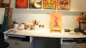
Studio workspace with rails and lateral drying shelves


Here are some recent photos of the new studio.

Note that there are lateral shelves between the workspace and file cabinets – great for drying paintings.  I need to work on three at a time or I overwork them (as you know).

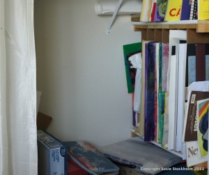
Vertical Files in Closet


The closet already had vertical shelves – for big paintings on one side and smaller ones on the other.

But I removed the doors and put up a shower curtain – easy and cheap.


Determining where to put the rails took a while, but most of my paintings are in the 16 x 20 category and these work great.  My pro photographer friend came over and helped me point the lights just right for photographing these on the workspace.  More about the lights later when I have time to look everything up for you.  They use very little juice and aren’t as hot as I expected.

I did get two gel mats from Bed,Bath and Beyond, which are a huge help.  Hardwood floors look nice, but they feel awful.

So, that’s the scoop!  The summer light comes in at an angle in the afternoon and evening, so it’s great.

Goals, Schmoals and Flores Brilliantes


Flores Brilliantes

Flores Brilliantes

Just realized when updating the Passion Flower post that I had set a goal to create 6 representational abstract flower paintings by the end of the month.  Well, that fell by the wayside for many reasons.

The first is that I got discouraged.  I started with blue background and yellow daffodils.  But I tried to make them look too realistic.  Then I tried bigger flowers and less background.  It was a mess.  I painted over this canvas so many times, I finally had to carve out the flowers.  And now it has become one of my favorite paintings.  The colors are awesome, and the rhythm is so perfect, but photographing it has been somewhat of a failure. Still learning to use my camera.

I’m going to get back to just picking three colors, like I did with Passion Flower.  Then making them work, and calling it finished!  Time is money, as we all know.

The other distraction has been getting my art studio set up.  It’s really great, well-lit and inspiring.  So, now I’m back to work today, I promise.